

Redesigning a Brand to Mark Ten Years in Support of Aging Adults
Senior Fund of St. Louis City
Senior Fund of St. Louis City is a vital funding conduit, channeling grants to the nonprofits and government entities that help older St. Louis City residents age in place with dignity and support. When the organization approached Hello And ahead of its ten-year anniversary, it came with a familiar challenge: a name that appeared inconsistently across materials, a visual identity that did not reflect the quality or scale of the work, and a need for design that could finally tell their story clearly.
Scope of Services
The Strategy
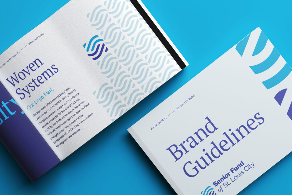
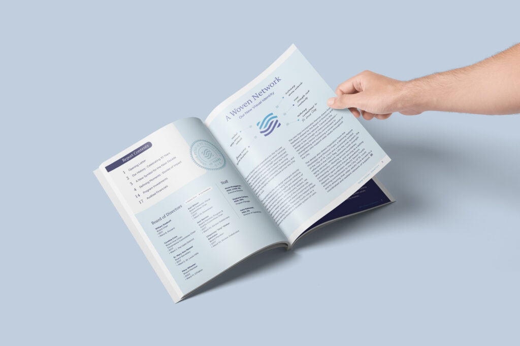
The first priority was establishing clarity: this is a fund, not a service organization, and it serves St. Louis City specifically, not the county or the broader region. That distinction matters to donors, partners, and the communities the Fund supports. Hello And worked to build a visual identity that captured the organization’s own language about what it does, weaving together a network of resources and relationships to strengthen the systems that aging adults depend on.
The Idea(s)
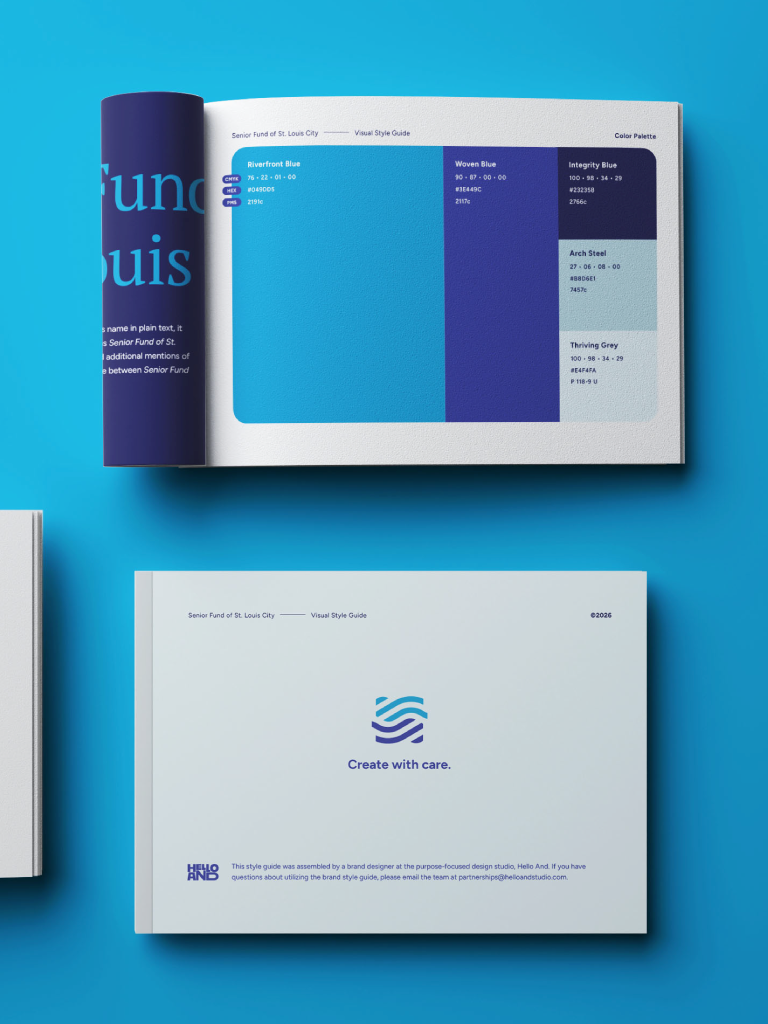
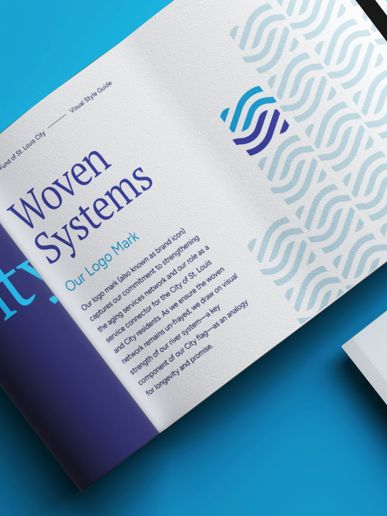
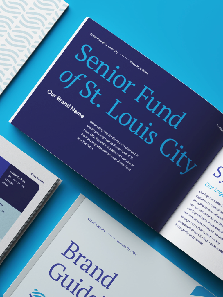
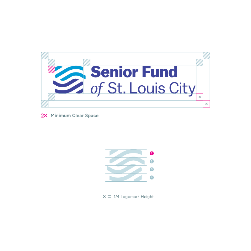
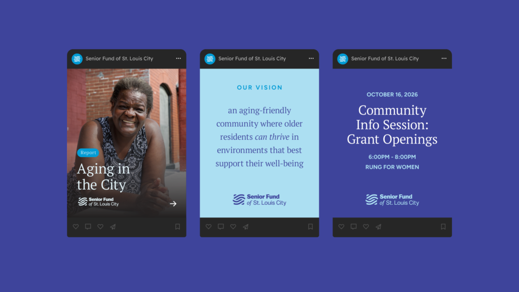
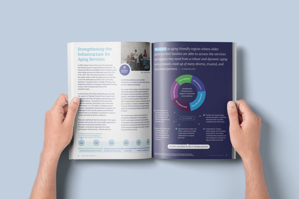
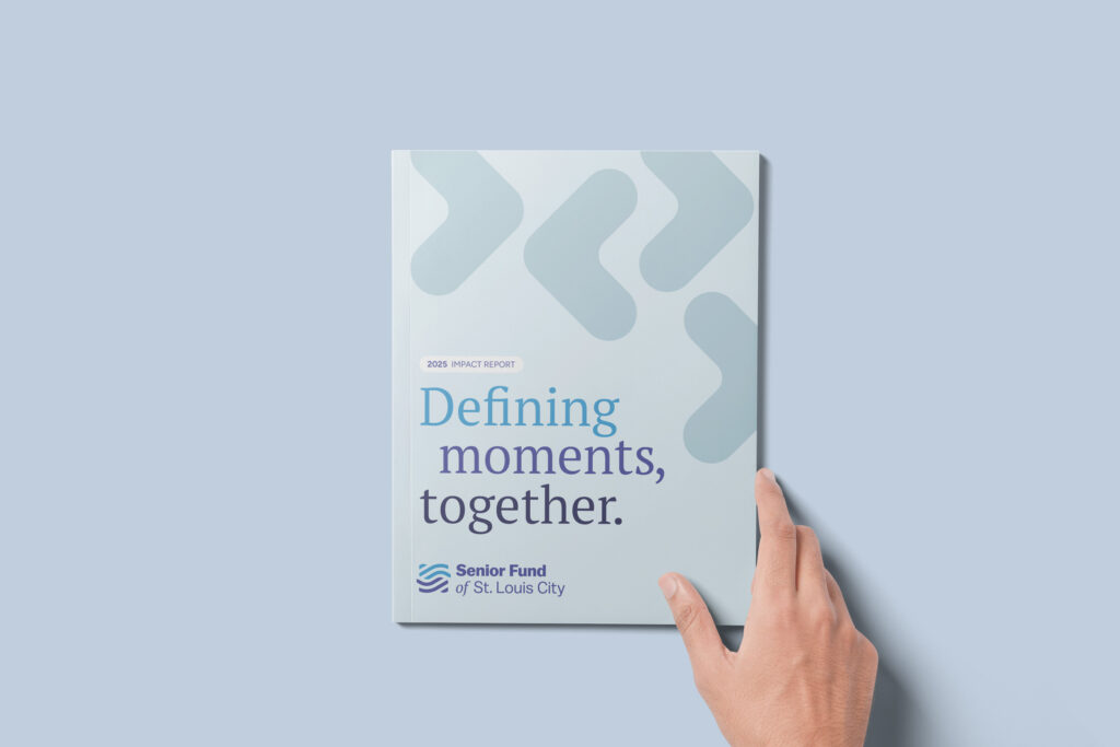
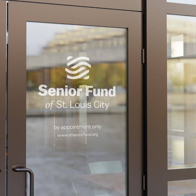
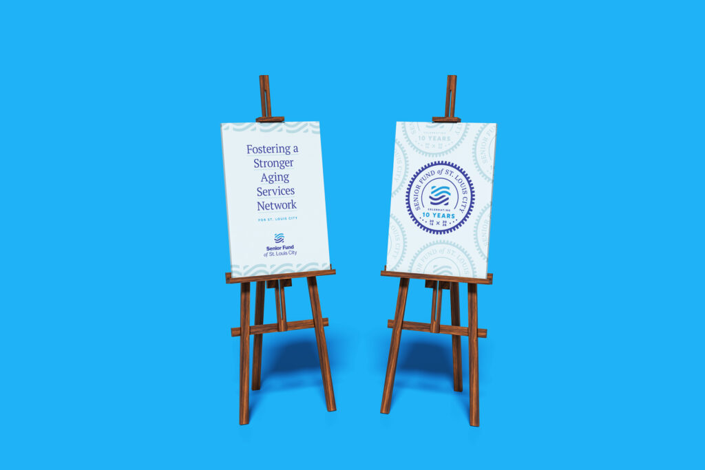
The woven network inspired the new logo. A mark built around the idea of interlocking, interconnected support gave the organization a visual anchor that was both distinctive and true to its mission. Internal discussions confirmed the name that would be used consistently going forward: The Senior Fund of St. Louis City. From there, Hello And developed a full system of tools the organization could actually use, including Canva templates for social media and other materials that put consistent, on-brand design within reach of any staff member.

The Delivery
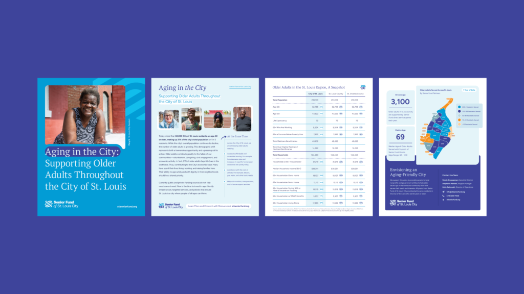
The Senior Fund came away with a visual identity that finally matched the credibility and impact of a decade of work. The brand system is coherent, the name is consistent, and the design materials are practical enough for a lean nonprofit team to maintain without outside help. For an organization celebrating ten years of quiet, essential work, the new brand gives them something they have long deserved: a presence that announces itself with the same confidence the work has always earned.

A Thoughtful Approach
Made Human
The power of this project lives in two places: the story woven into the visual identity itself, and the human photography that brings the mission to life. When the people a brand serves are visible in the design, the work stops being abstract.